Create a timeline of selected event metrics as 'lollipops'.
Source:R/graph_functions.R
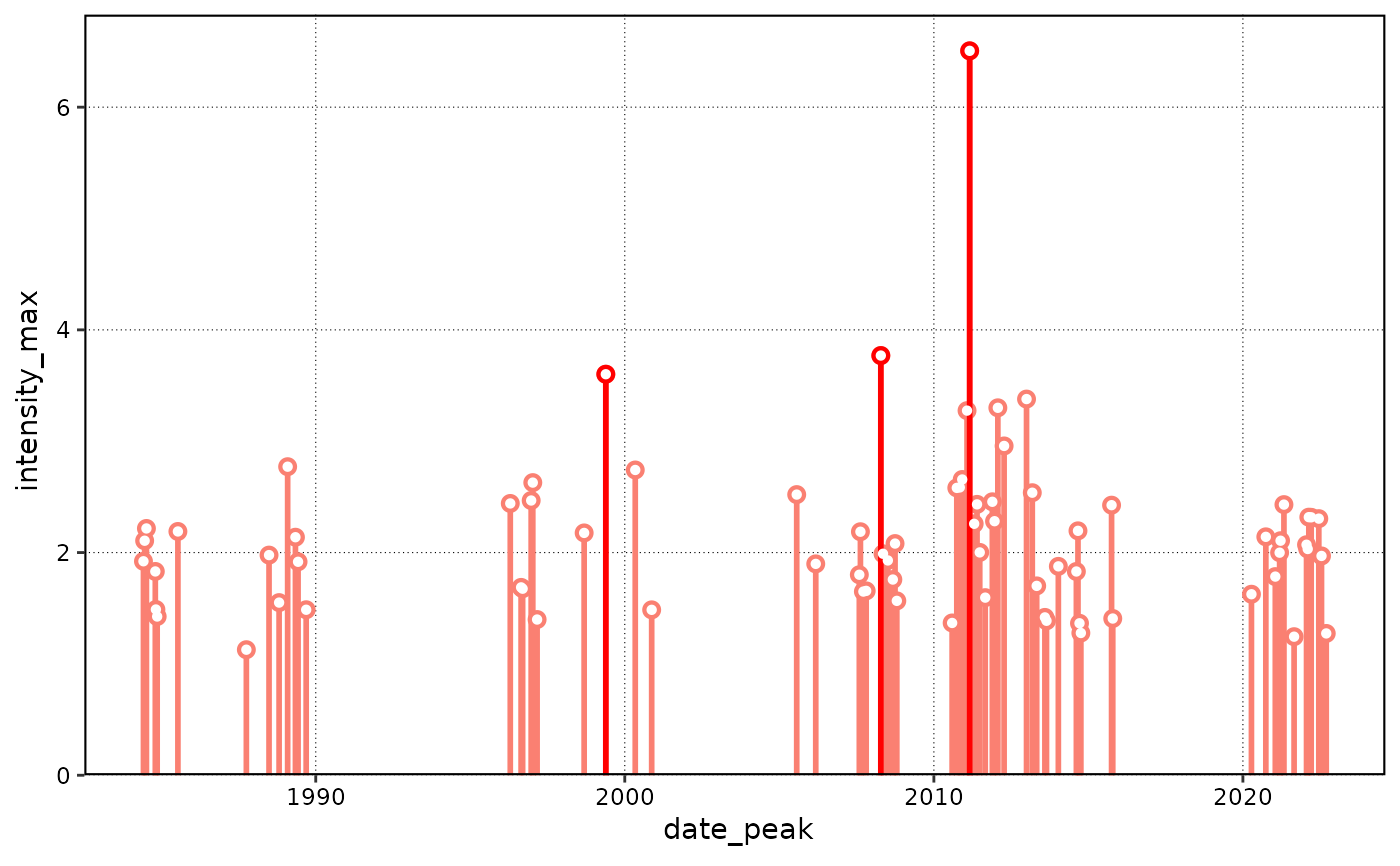
lolli_plot.RdVisualise a timeline of several possible event metrics as 'lollipop' graphs.
Arguments
- data
Output from the
detect_eventfunction.- xaxis
The name of a column from the
eventdata.frame in the output ofdetect_event. Suggested choices are, but not limited to, ofevent_no,date_startordate_peak. Default isdate_peak.- metric
The name of a column from the
eventdata.frame in the output ofdetect_event.Suggested choices are, but not limited to,intensity_mean,intensity_max,intensity_cumulativeandduration. Default isintensity_max.- event_count
The number of top events to highlight, as determined by the column given to
metric. Default is 3.
Value
The function will return a graph of the intensity of the selected
metric along the y-axis and the chosen xaxis value.
The number of top events as per event_count will be highlighted
in a brighter colour. This function differs in use from geom_lolli
in that it creates a stand-alone figure. The benefit of this being
that one does not need any prior knowledge of ggplot2 to create the figure.
Examples
ts <- ts2clm(sst_WA, climatologyPeriod = c("1983-01-01", "2012-12-31"))
res <- detect_event(ts)

library(ggplot2)

# The default output
lolli_plot(res)